just now

Liquidity Finder Ltd is incorporated in England and Wales, company number 10610740, registered address 167-169 Great Portland Street, Fifth Floor, London W1W 5PF, United Kingdom.
Published: just now
The Dot Plot is a glimpse inside the minds of the people who control U.S. interest rates. That’s really the simplest way to think about it.
You can get access to the DoPlot using the CME and look for the “Dot Plot” section that will be on the rigth side of the tool.
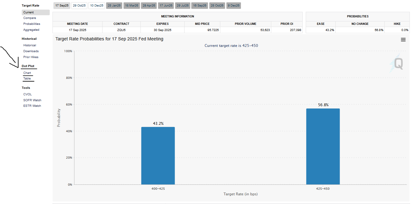
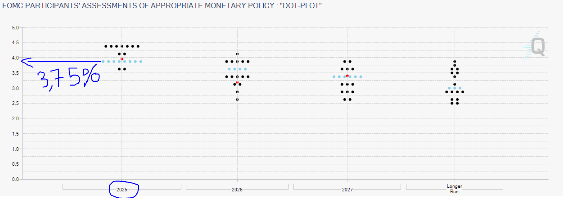
Once you click into the Dot Plot this is what you will be able to see
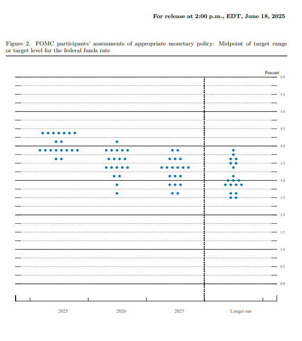
Four times a year, the Federal Reserve publishes a report called the Summary of Economic Projections (SEP).
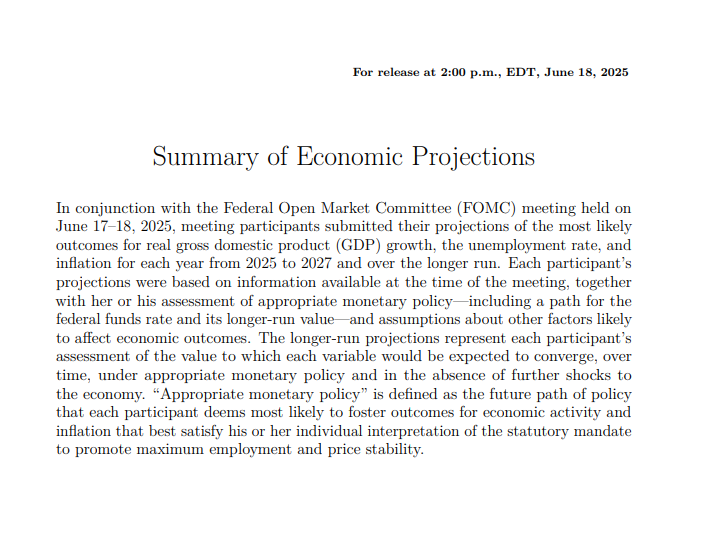
Inside that report is this chart the Dot Plot. Every voting member of the Fed places a dot showing where they personally think interest rates should be at the end of this year, next year, the year after that, and in the longer run.
No names attached. Just opinions, visualized.
So when I look at it, what I’m really seeing is the range of expectations from the people who are literally moving the economy. To me, that’s not noise. That’s a signal.
This isn’t just some survey of random economists. The dots come from the Federal Open Market Committee (FOMC) which is made up of:
The 7 members of the Fed’s Board of Governors, and
12 regional Fed bank presidents
That’s the core team that sets U.S. interest rates.
Whether you're a trader, investor, or someone who just wants to understand how this all works these are the people whose opinions actually move markets. When they post those dots, I pay attention, and you should as well!
Okay, this part used to confuse me. But here’s how I broke it down so it actually makes sense:
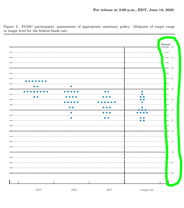
Each column of dots shows projections for different years, this year, next year, the following year, and the “longer run.”
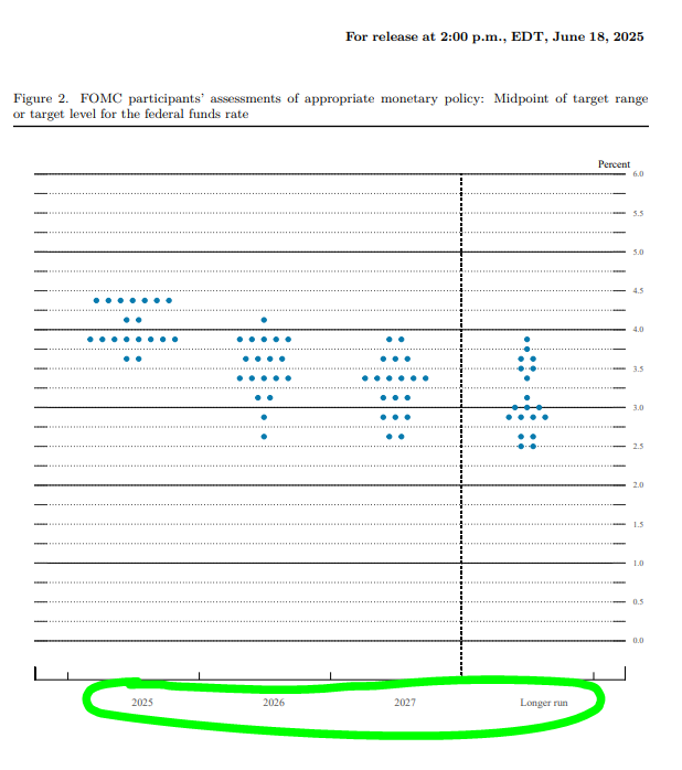
This tells you where each member thinks the federal funds rate should be basically the interest rate banks charge each other.
Each dot is one person’s forecast. That’s it. They’re anonymous, so you don’t know who said what, but that’s not the point. The power is in the pattern.
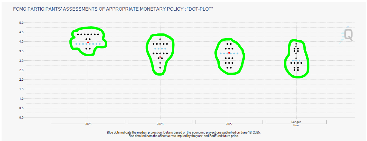
I always look for the clusters. If most dots sit at 4.5% for next year, that’s where consensus is forming. That tells me what the Fed as a whole is leaning toward.
More dots higher than the last release? They’re signaling more hikes ahead.
More dots lower? That could mean cuts are coming.
Flat? They’re saying rates are staying unchanged.
It’s not a promise it’s a projection. But I treat it like an early weather forecast. I’m not planning a beach day off it, but I sure won’t ignore the storm clouds.
This is the part that changed the game for me.
I don’t read the Dot Plot because I’m into monetary theory. I read it because it gives me an edge. It helps me stay ahead of market moves especially during Fed-heavy weeks, when uncertainty is high and volatility is even higher.
Here’s how it fits into my actual decision-making:
Markets don’t move just on what the Fed says they move on whether that message is more hawkish or dovish than expected.
So if the market is expecting rate cuts, but the dot plot doesn’t show that? That’s a shock. And shocks = opportunity.
I’ve made trades just by being on the right side of that gap.
If I see a shift in the longer-term dots especially the “longer run” column that tells me something about how the Fed views the economy and inflation long term.
That helps me decide whether to lean risk-on (stocks, growth, crypto) or risk-off (bonds, cash, defensives).
If the Dot Plot is being released, I treat it like earnings season for interest rates. I know markets might whipsaw. I size down. I wait for clarity. I don’t try to be a hero.
Just a few lessons I’ve picked up from reading this chart over the years:
There’s always one or two people predicting extreme moves. Unless that becomes a trend across meetings, I ignore them.
The story isn’t in a single chart it’s in how the chart is evolving. I always pull up the previous Dot Plot and look at what changed. Are dots moving up? Down? Flattening? That’s the Fed shifting its tone.
I don’t use the Dot Plot in isolation. I pair it with inflation reports, unemployment data, and earnings. But it is a critical piece of the puzzle, especially for macro-sensitive assets like gold, rates, and tech stocks.
The Fed Dot Plot isn’t about being fancy. It’s about being informed.
I use it because I want to know where the people who set policy think we’re headed. I want to be ahead of the curve not reacting once the market already priced it in. The Dot Plot helps me do that.
It’s not a crystal ball. But it’s one of the clearest windows we get into the Fed’s collective brain and if I’m trying to make smart trades, why wouldn’t I look through that window?
Q: Is the Fed Dot Plot a prediction or a promise?
A: It’s not a promise just a projection. It shows where each Fed member thinks rates should go based on what they know right now. Things change. The Dot Plot gives us insight into their mindset, not a locked-in path.
Q: How often is the Dot Plot released?
A: It’s released four times a year March, June, September, and December right after the Fed’s FOMC meeting. Those are the dates I circle on my calendar because I know markets are watching closely too.
Q: What does it mean when the dots are spread out?
A: Great question. A wide spread means there’s disagreement inside the Fed not everyone sees the future the same way. That usually signals uncertainty and can lead to more volatile market reactions. I pay even closer attention when I see a messy Dot Plot.
Q: Can I trade the Dot Plot by itself?
A: I wouldn’t. It’s powerful, but I always use it together with other data like inflation reports, job numbers, and what the Fed Chair actually says in the press conference. The Dot Plot sets the stage, but the whole performance includes more than just one chart.
Q: What should I do if I don’t understand all the dots yet?
A: Honestly? That’s totally normal. It took me a few meetings to really get the hang of it. Start by focusing on the overall trend and where the majority of dots are landing. Keep it simple at first. The more you follow it, the more natural it becomes.
Further Reading: Deepen Your Trading Knowledge
Continue sharpening your market analysis and trading strategies with these hand-picked guides across gold, macroeconomics, risk sentiment, and trading psychology that I’ve wrote!
Economic Data & Macro Strategy
Trading Skills & Execution
This content may have been written by a third party. ACY makes no representation or warranty and assumes no liability as to the accuracy or completeness of the information provided, nor any loss arising from any investment based on a recommendation, forecast or other information supplies by any third-party. This content is information only, and does not constitute financial, investment or other advice on which you can rely.
ACY Securities is one of Australia's fastest growing multi-asset online trading providers, offering ultra-low-cost trading, rock-solid execution, technologically superior account management and premium market analysis.
Select the categories and companies you wish to follow directly to your person rss feed.
Create Custom RSS FeedSign up and join over 5,000 professional members who receive personalized news alerts, curated professional connections, and more for free!
The Award represents the latest milestone in PLUGIT's strategic evolution toward becoming a leading Brokerage Technology Provider, delivering one connected trading technology solution for modern brokerages.
Looking for a NAS100 price action forecast? See how the Head and Shoulders pattern triggered a massive drop and why our bearish setup won.
Discover how tracking active drilling rigs acts as a vital energy sector indicator for future oil supply.
Want to master consistent trading? Discover why your daily routine matters more than a new strategy to improve your trading psychology.
Discover why these weekly reports drive global energy demand, inflation, and market volatility.
Read our latest NAS100 price action forecast to see if a massive Head and Shoulders pattern will trigger a major bearish trend and sell-off.
Want to find the best reversal chart patterns before they happen? Learn how to identify bullish and bearish reversal patterns and confirm trades.
The YOONIT Broker Technology Solution by PLUGIT.
Brokers replacing fragmented tools with connected ecosystems are gaining real competitive advantage. Discover how YOONIT makes it possible.
Explore how YOONIT Copy Trade solution gives brokers the visibility and control to run revenue driven copy trading activities.