Search Companies, News, Members & more
Terms of ServicePrivacy PolicySecurity PolicyLegal InformationCommunity GuidelinesSitemapsCookie Settings
2026 Copyright © Liquidity Finder Ltd. All rights reserved.
Liquidity Finder Ltd is incorporated in England and Wales, company number 10610740, registered address 167-169 Great Portland Street, Fifth Floor, London W1W 5PF, United Kingdom.
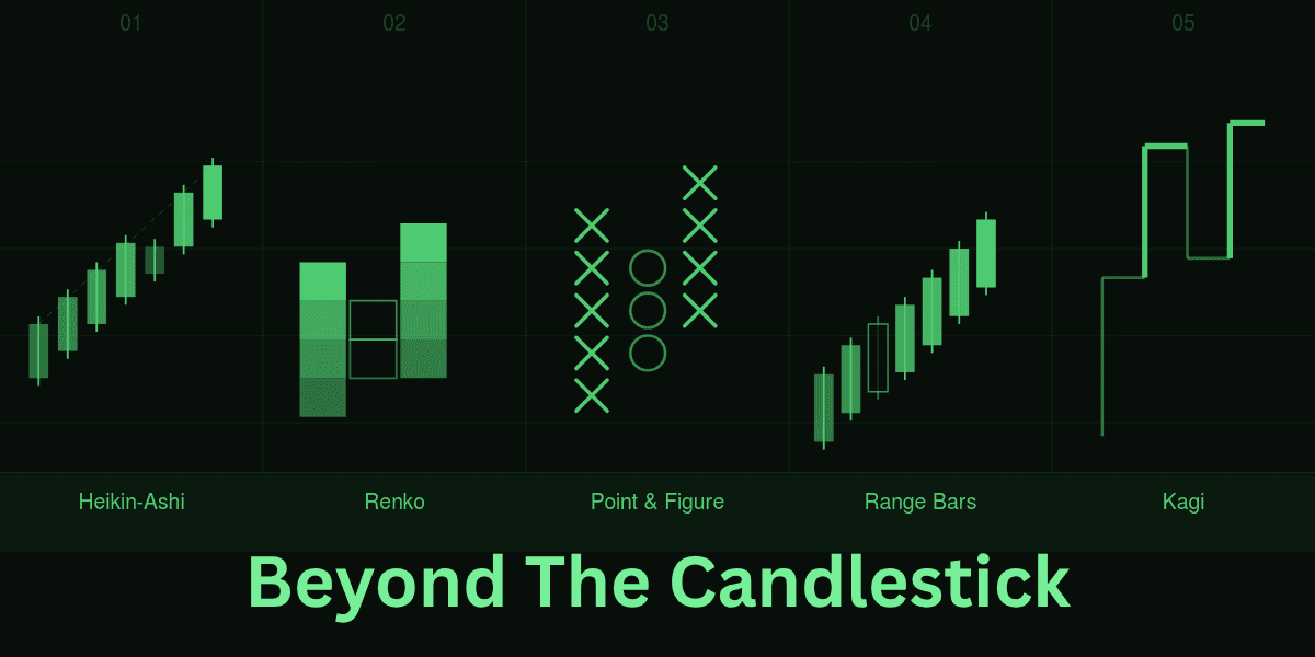
Beyond the Candlestick: Using Advanced Chart Types on Modern Platforms
Published on May 5, 2026
Updated on May 5, 2026
Insight • Charting & Analysis
Beyond the Candle: Five Chart Types Worth Adding to Your Trading Screen
A practical guide to Heikin-Ashi, Renko, Point & Figure, Range Bars and Kagi — and how to slot them into your existing workflow.
The candlesticks are the global price display tool — handy, dependable and well-known. Still, even their most ardent supporters concede that candles can bury subtle structure under intra-bar noise and whipsaws. The current charting engines are capable of producing much more than candles, and many of the other forms are arguably more effective at bringing out structure, momentum and risk. In the next fifteen minutes you might discover which non-standard charts could earn a place on your screen, why they matter and how to slot them into an existing workflow with minimal disruption.
The Case of Looking Beyond the Candle
Price is a continuous variable, which is, however, sliced by time into fixed intervals by time-sliced candles. That is reasonable in intraday bookkeeping but introduces arbitrariness: a five-minute bar which closes at 9:35 will choose an arbitrary endpoint that could not have meaning in the market. Take that by hundreds of bars and you have a dim picture.
The alternative charts address the fog in two ways:
1They rearrange the x-axis, causing price, range, or reversal size to be the organizing principle rather than clock time.
2They also reduce fractal noise either through averaging or by grouping small swings into blocks.
The two methods minimize false positives for many participants but do not conceal significant reversals, which is often what systematic traders are looking for when order books, heat maps and screeners already compete for attention.
Proven Alternatives Worth Your Screen Space
Any trading desktop, mobile and browser-based trading platform ships with at least a dozen exotic charting options. The top five that provide a favourable signal-to-noise ratio with limited screen real estate are shown below. We shall also make the mathematics light and focus on interpretation.
Heikin-Ashi: The Trend Whisperer
Heikin-Ashi (average pace in Japanese) averages the close and the open by averaging the values of the previous candle. This creates a falling staircase whereby adjacent bars tend to have the same color of dozens of prints. Because of the visual continuity, trend changes can stand out more readily than on raw candles.
How traders read it:
🔹 Market practitioners sometimes look for a cluster of like-coloured bars as a shorthand for directional bias.
🔹 Doji-sized bodies with long shadows are occasionally viewed as exhaustion markers.
Its real beauty is intellectual: your eyes no longer play between the green and the red spikes but rest on broader tonal expanses. Many users still confirm with a traditional oscillator, although the relative merit of double-checking remains debated.
Takeaway
Heikin-Ashi tends to appeal to operators who already hold a directional thesis and who prefer a visually calmer backdrop for timing exits or pyramids. Just remember that smoothing always introduces lag and may hide fast reversals.
Renko Blocks: Time Out of the Equation
Renko charts are used to draw a new brick once the price changes by a specific amount, e.g. 10 ticks in futures or 50 pips in FX. Sideways congestion leads to zero bricks due to the fact that time is not taken into account. When your brain is suddenly released of irrelevant micro-fluctuations, it is able to see support and resistance shelves within seconds.
Brick size is the linchpin. Instead of a fixed recipe, most desks iterate through several magnitudes (fractions of ATR, percentage of spot price, fixed tick counts, etc.) until the output mirrors their time horizon. Candles that are too small create noise, while those that are too large flatten trades into binary events.
Edge and its limits
According to the algorithmic study of S&P E-mini contracts, it appears that the application of an ATR trailing stop of Renko charts can theoretically improve the risk-adjusted returns compared to the same approach to 15-minute candles. The big draw of Renko is noise filtration, yet the methodology naturally reduces the number of signals, so missing an inflection point can be costly. Slippage, spreads, and overnight gaps can further erode theoretical advantages.
Point and Figure: Demand in Black-and-White Supply
Point and Figure (P&F) is as old as ticker-tape, but it is still unnerving in identifying breakouts that do go. The chart is constructed of Xs (rallies) and Os (declines); every mark marks a box, and a new column is added after price reverses by a multiple of that box that one sets.
Why does this help? P&F suppresses micro pullbacks that nickel-and-dime trend traders. The length of an X or O column can be translated into horizontal counts, a traditional method for estimating price objectives; nonetheless, the reliability of such counts varies across assets and cycles and should be validated with independent data.
Typical template:
🔹 Many chartists start with a three-box reversal and overlay volume-at-price shading plus 45-degree trend lines, but the exact numbers are a personal calibration, not a universal prescription.
🔹 Breaks of a bullish line are watched for potential weakness, whereas fresh columns above that line are watched for potential strength — a conditional approach rather than a binary order trigger.
P&F delivers a black-and-white narrative that some find refreshing. Detractors argue that ignoring time can obscure the sequence of news events, so P&F should live alongside, not replace traditional charts.
Range Bars: Volatility-Aware Candles
Vicente Nicolellis, a Brazilian trader, used tick charts as the basis of his range bars with each candle having a set high-low distance (such as 0.5% of close). It is only after it reaches that range that the bar closes, and hence, sideways markets become a few bars and trending phases become long smooth staircases.
Application
High-frequency scalpers are fond of range bars since all the bars are all risk, and position sizing is easy. They are used to isolate implied volatility spikes by options traders, who suspect that range bars are about to accelerate and IV is probably growing.
Parameter sketch
A common heuristic is to calibrate range length somewhere in the lower quartile of recent true-range observations; the exact cutoff, however, is best stress-tested on each market to avoid curve-fitting.
Kagi Lines: The Accumulation Vibrations
Kagi charts were created to monitor the prices of rice in Osaka in the 19th century and have remarkably stood the test of time. A Kagi line becomes thick as the price moves to move above the last swing high and becomes thin in moving back by a set reversal value. The vertical lines that are always of the same width combined with the right-angle turns cause the swing highs and lows to stand out.
This is the case with institutional desks such as Kagi since the change in thickness will reflect the change in buying or selling pressure. Some analysts overlay a medium-term moving average for confirmation; others prefer pure-price Kagi to avoid indicator stacking.
Kagi is a storyboard of crowd psychology at a glance but can be whipsawed when volatility compresses, a reminder that no single format cancels risk.
Incorporation of Exotic Charts in an Existing Workflow
The change in chart type can be almost like learning a new language, although change is painless when you use it to complement your existing decision tree.
1Retain the primary time-based candle for execution so that logs and broker APIs stay intact.
2Dock the alternative chart in a linked pane and sync cross-hairs for one-click perspective shifts.
3Port indicators gradually; layering RSI, MACD, Bollinger Bands and VWAP all at once can cloud attribution.
4If your platform supports it, trigger alerts from the exotic chart but route orders from the core chart to keep order tickets familiar.
One month of such doing will answer whether the exotic chart is introducing fruit or simply novelty. The twin yardsticks are fewer draw-downs caused by false starts and more conviction in letting winners breathe.
Managing Risk When Chart Dimensions Change
A conversion of coordinate system requires a recalibration of the stops and position sizing. There are three rules that will not allow surprises:
🔹 Translate pattern distances into ATR or percentage terms before entering, or you may mismeasure exposure.
🔹 Mind overnight gaps; time-agnostic charts often hide them inside a single block. Marking the New York close helps keep gaps visible.
🔹 Expect longer forward tests; fewer signals per calendar week mean statistical significance takes more time.
Non-standard charts can strip away noise, but they also tempt quants to over-optimise parameters. Robustness, not novelty, is the real edge.
Speed Bumps and Workarounds on Popular Platforms
Alternative styles still creep up even in practically all retail and professional packages.
Latency Quirks
Renko and Range bars constructed on the server-side data are faster than their clients. When your platform constructs bars on-site using tick streams, there will be a small discrepancy between exchange-timestamped bricks and your local bars on fast markets. One of the solutions is to refresh or reconnect all the open sessions.
Back-testing Hurdles
Time bars were the basis of the majority of strategy testers. Fills can be truncated by conversion of a Kagi reversal to discrete timestamps. Find engines with support of event-based backtesting, or export series to CSV and execute the logic in Python with Python libraries such as backtrader or vectorbt.
Mobile Limitations
Certain mobile apps display no interactive features with merely statical images of Point and Figure. Traveling, pre-set desktop alerts and allow the mobile phone to act as a notification device and not as an analysis device.
A Step-by-Step Checklist of Adoption
Better habits win over smart theories, so here is the routine that many pros use in using a new type of chart.
1Choose a market that you are familiar with. The acquaintance assists in separating the chart-type effects and underlying surprises.
2Lock the parameters of one alternative format for at least four weeks – tinkering mid-trial muddles findings.
3Monitor the following important metrics: win rate, average R multiple, time in trade, and mental stress level (a simple 1-to-5 per day score suffices).
4Compare distributions after 20-30 trades. Search a statter tail of winners and a thinner tail of losers, it is less informative to search a mere change in average P&L.
5Only at this point extend to other symbols or forms of charts. Rinse and repeat.
The next cadence continues improvement in a cumulative, but not chaotic, manner, a discipline the Technical Analysis of the Financial Markets, by John J. Murphy, promotes a very structured, step-by-step construction of a trading system, as opposed to running a trading system by feel.
Conclusion: Unearthing the Market's Framework
Replacing candles with Heikin-Ashi, Renko, Point and Figure, Range bars, or Kagi is less about novelty than about filtering out data you cannot exploit and amplifying what you can. Each style attempts to surface the skeletal themes of trend, support, and exhaustion so that decisions feel faster and clearer.
Run an A/B test for a month. If the exotic feed dampens noise without hiding critical turns, keep it. If not, discard without regret. The ideal payoff is steadier focus, fewer false starts and — with disciplined execution — an equity curve that tilts upward over time, though no chart type guarantees that outcome.
Disclaimer
The material presented in this article is intended solely for informational and educational purposes. It does not constitute financial, investment or trading advice, and it should not be relied upon as a recommendation to buy, sell or hold any financial instrument (including but not limited to CFDs). Trading carries risk of loss to capital. Always conduct your own research and, where appropriate, consult a licensed financial professional before making investment decisions. The author and publisher accept no liability for any loss or damage arising from the use of this information. Past performance and hypothetical examples are not indicative of future results.

About the Author
Kostiantyn Huznishchev
A financial markets writer and researcher specialising in market structure, trading technology, and price analysis techniques. With a focus on how modern platforms reshape the way traders interpret data, Kostiantyn Huznishchev covers topics ranging from charting methodologies and execution workflows to liquidity dynamics across asset classes, including FX, indices, commodities, and equities (often traded via CFDs).
Their work aims to present complex trading concepts in a clear, balanced, and practical manner, supporting readers in understanding both the potential applications and limitations of analytical tools. Articles by Kostiantyn Huznishchev emphasise evidence-based perspectives, risk awareness, and the evolving intersection between technology and trading decision-making.
Found this interesting? Become a member of LiquidityFinder and get daily industry news direct to your inbox — join here.
Share this article
Comments
Most Recent
Find The Right Partners for
Your Trading Business
Sign up and join over 5,000 professional members who receive personalized news alerts, curated professional connections, and more for free!
The definitive list of genuine prop trading firms and funded account challenges for 2026.

We examine Plus500's spreads, regulatory standing, platform capabilities, and who it actually makes sense for in 2026.

Keep an eye on key upcoming economic events, announcements, and news. Plus, set up filters in a few clicks, selecting for event importance and affected currencies.

Over-the-counter (OTC) trading refers to transactions conducted directly between two parties, outside of centralized exchanges. This guide explains how OTC markets work in forex, crypto, and equities, including the role of dealers, pricing mechanics, and why institutional players often prefer OTC execution.

We thought it would be of interest to the members of LiquidityFinder to let our users know what company they keep, and the analysis of our user base has revealed some interesting insights into the community we've built together.
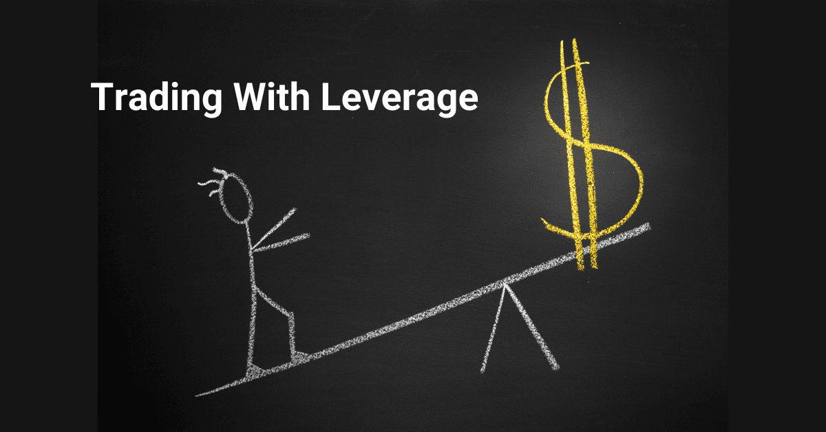
This guide covers how leverage works across different asset classes, margin requirements, and the risk management practices every leveraged trader should follow.

Gain insight into cTrader, a leading ECN trading platform. Explore its features and advantages with comparison to the established MetaTrader, helping you to choose the ideal platform for your trading needs.

Understanding toxic flow, latency arbitrage, and how to protect your brokerage book from sharp traders.
Create Your FREE Account
Get access to latest news, updates, real-time data, brokerage and trading firm insights and customized information feeds.

Darwinex has integrated with TradingView, letting traders on the charting platform build a verified, publicly auditable track record from every trade. The move links Darwinex's regulated broker and Darwinex Zero development platform to investor capital allocation, based purely on trading performance.

Pepperstone has appointed Mohammed Almadhoun as Head of Middle East and Osama Hamdan as Head of Sales, strengthening its regional leadership team as the FX and CFD brokerage continues its expansion across the UAE, GCC and wider MENA region following its Dubai office launch.

Payments company Stripe and private equity group Advent International have launched a joint offer to acquire New York-listed payments group PayPal in a deal that would value the business at around $53bn, according to the Financial Times.

ATFX has launched the World Trading Cup, a three-stage trading competition offering up to USD 210,000 in prizes. Pre-registration opens 20 July 2026, with regional qualifiers and finals leading to a global final in December, where 15 traders from five regions will compete for the championship title.

Explore how blockchain is transforming trade finance, its key opportunities, and real-world use cases in global trade.

Binance has launched U.S. equities trading via its ADGM-regulated broker-dealer, Nest Trading Limited, offering over 7,000 stocks and ETFs with zero commission and fractional shares from $5. The exchange also plans to introduce bStocks, tokenised U.S. securities issued through an ADGM-registered SPV.

Gold-i has enhanced its Visual Edge risk management solution with new historical VaR, CVaR, Monte Carlo simulation, stress testing and Negative Balance Protection features, giving regulated brokers deeper portfolio analytics and real-time exposure data to support risk decisions across clients and business-wide portfolios.

Global multi-asset fintech group Plus500 has reported record Customer Income for the first half of 2026, with the figure climbing 24% year on year to $460.8m, the strongest six-month performance in five years.
A guide on trading CFDs for beginners. This guide walks through a practical seven-step framework that explains exactly how to trade CFDs, whether you’re completely new to the markets or looking to sharpen an existing trading process.
Running a brokerage has always meant juggling disconnected scripts, manual server logins and hours of repetitive back-office work - each one an opportunity for delay, inconsistency and human error. The Broktinger Tool Suite replaces all of it with a single interactive portal that brings every operational tool a broker needs into one coherent environment. Monitor performance, exposure and risk in real time. Process balance operations and dividend allocations in seconds. Update swaps, margins and spreads across groups and symbols with a single click. Connect third-party platforms straight to MT4 and MT5 via the MT API Integration Bridge. One workspace, every tool, and far less manual work.
Feed